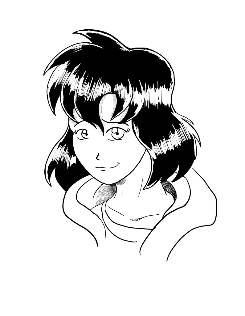
Just a quick little sketch I did today of Kalwa, practicing the new hair highlighting pattern. I’ve always felt that the highlights didn’t stand out that well and dynamically and for years I’ve wanted to modify it to look more epic and detailed but could never find a solution. Thanks to some critiques I feel I was finally able to find the answer. Expect more drawings like this in future comic pages.
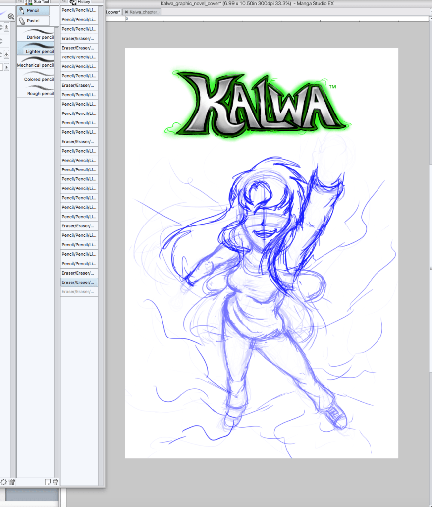
The first published volume of the Kalwa Graphic Novel is upon us soon. So it’s full speed ahead on the the cover. This little break from chapters has given me the time I need to hone my drawing style, and now I’m now experimenting with angles and adding more motion into my work, so hopefully when I come back to doing actual chapters, I can better enhance the artwork. The first volume will be hitting digital in June and hardcopy in July. More updates on progress will be coming along!
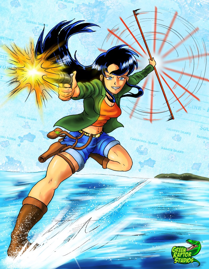
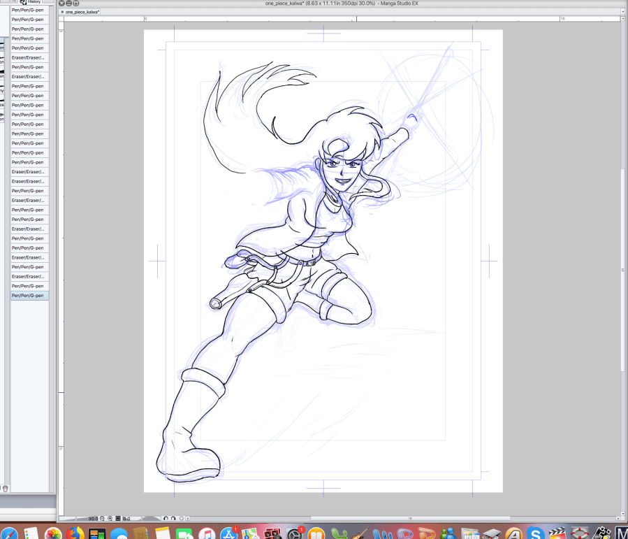
Third entry in the Kalwa in Anime series, this entry is if Kalwa lived in the One Piece world, ironically this started off as an illustration with nothing before exploding in a wild storm of posing and action affects. Only two more left in the anime illustration series.
So it’s been a little bit, but I’m still continuing the series of Kalwa in Anime illustrations. The previous illustrations were Kalwa if she was in the Dr.Stone world and Naruto world, this upcoming one will be the One Piece world. Here’s a little preview of whats to come.
So I know there isn’t really that much going fun in seeing screenshots of this, but I’m just letting everyone know that writing is officially underway. We are getting back into gear for next month!!!!
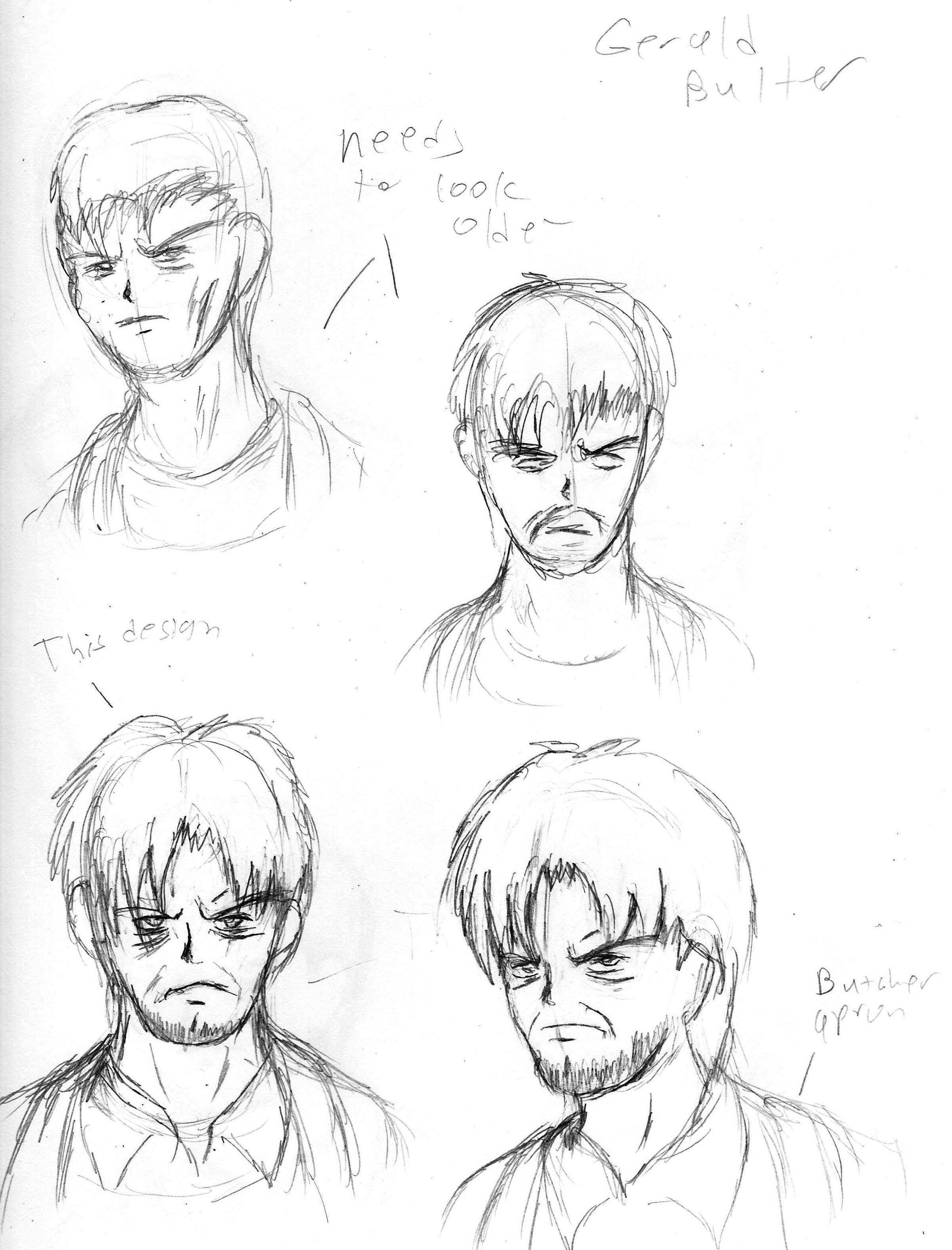
Of all the stories we’ve done in Kalwa, the story with the most backstory is the Whitechapel story arch, which had been a long planned story arch from the day this comic started. Over the course of time, I’ll start sharing all the backstory about this story. Right now, I’ll start of with possibly one of the more vital characters in the arch Gerald Butler, who can be considered the tertiary antagonist of the arch. Racism was actually a major part of the story, as historically there may or may not have been prejudice agains the jewish community at the time of the Whitechapel murders. Gerald Butler was meant to represent that racism, but he also took several other cues from historic Whitechapel locals.
Of course the first thing to note about Gerald is that he is butcher, which is actually a suspicious, yet easy to escape occupation during the murders. Butchers were often time covered in blood, which actually them the perfect cover up for crowds. In fact historically the actual “Jack the Ripper” may escaped into the crowd after killing one of the “canonical five,” yet was able to escape as he wondered through a part of town where many butchers worked, thus blood on his clothes would not be unusual. In fact the scene where Gerald is walking with a bloody knife is actually a reference to this.
Design wise, Gerald came out very different than what I originally envisioned. I had intended Gerald to look much more slick possibly with some characteristics of what I would consider french looking (small mustache, thin neck). However these characteristics made the character look far too young, especially given that he was meant to be the father of full grown woman. So the character went through a couple of revisions, he was given a much more gruff appearance and more wrinkles under his eyes to represent both his malice, his age and at the same time his very unstable mind. Gerald I think is probably in my opinion the definition of continued to design, to keep designing and don’t go right away with the first look. As horrible as his character is (moral wise) he actually is one of my favorite villain designs in the series so far.
Straight from the sketchbook this is the first sketch of Orestes, the first enemy that Kalwa encounters on her travels. Mostly the character went unchanged from the initial design, the only real details being his footwear and his toga being made shorter mainly to accommodate him running. The wrinkles under his eyes were also added later, though they were purposely held back until after his true nature is revealed. As the character was meant to be very minor, his design was meant to be somewhat unique from background characters, though a little less detailed than more important characters. When he was first introduced, there were no plans to have the character return, this was added later to give the character closure. The return actually gave me a chance to redesign the character to look much more villainous than the first arch, which couldn’t initially be done as we were trying to make the character look innocent until his ultimate reveal.
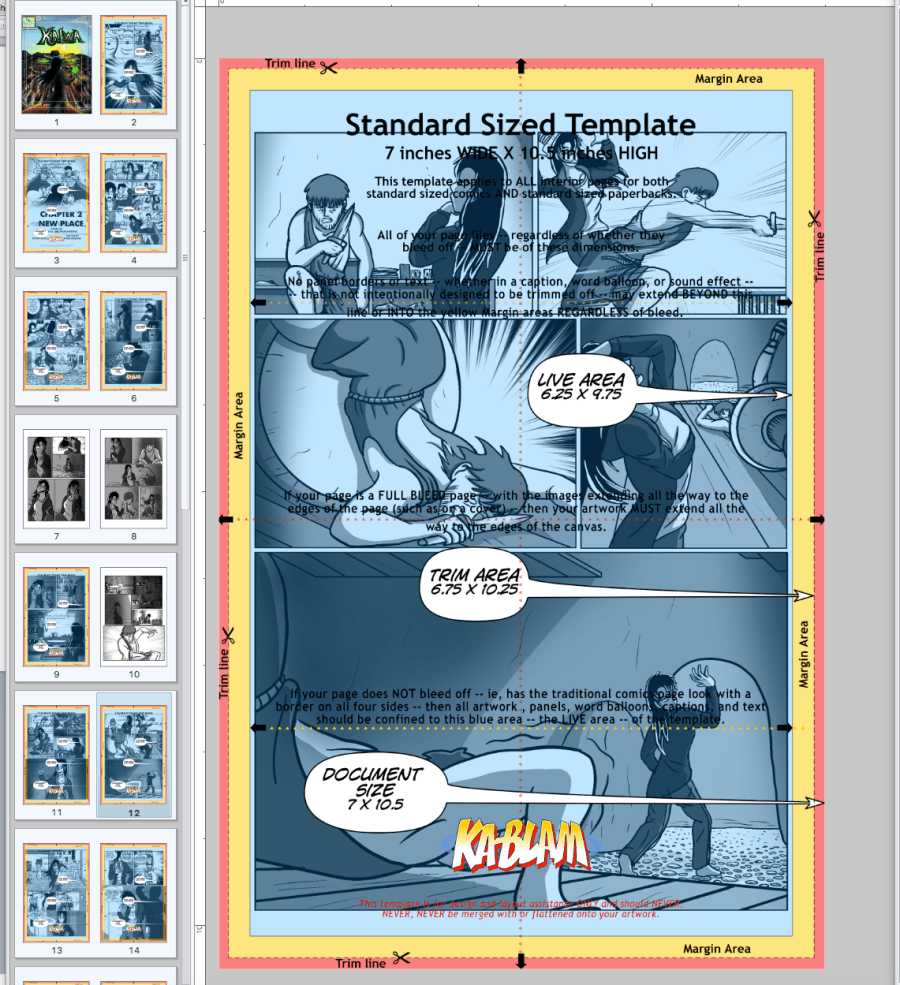
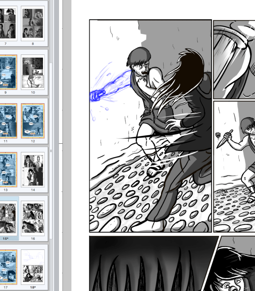
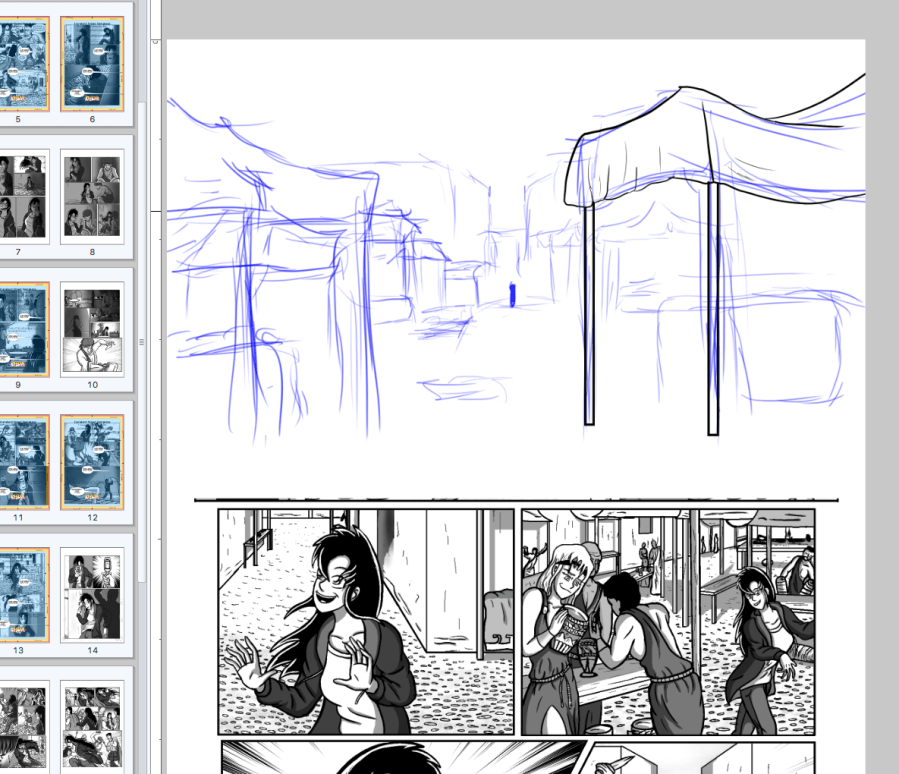
Just some updates on the upcoming publication plans, chapter 1 has been mostly finished aside from dialogue changes, chapter two is now underway. I actually just finished cutting panels to fit in the template, now I’m starting to work on some slight redraws (see screen caps below), to better the illustrations and make a bit more impact. Looking to have the first vol finished by June!!!
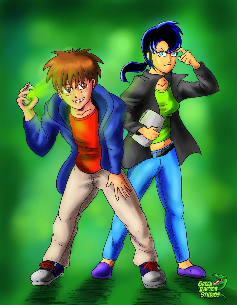
So this idea just came to me yesterday and I just had to make it a reality. This is a revers role illustration of what the series would look like if Reko was the eccentric one with the phone and Kalwa was the head smart tech girl with the glasses. Actually kinda liking the glasses Kalwa quite a bit, she was actually based on Barbra Gordan as she appeared in Arkham Origins! Reko kinda came out looking a bit like Sora from Kingdom Hearts, though he was actually based a bit more off Yoshimori from Kekkaishi, a show I’ve only watched a few times.